In a world where shopping for just about anything is literally at our fingertips, it’s more important than ever to follow mobile design best practices. In 2020, mobile devices drove 61% of visits to U.S. websites! This is compared to only 35.7% from desktops and 3.3% from tablets. With stats like that, how could you not prioritize your mobile user experience?
Why Mobile Optimized Strategies & Design Matter
Ensuring that your website is optimized for mobile has a variety of benefits. First, Google now has mobile-first indexing. This means that Google primarily uses a website’s mobile version to determine its relevance to a search query. So, websites that are not mobile-friendly will experience a negative impact on search rankings.
Second, mobile popups, no matter how enticing they may seem as a strategy to grow your email list, can be irritating to shoppers when poorly executed. So much so that it led to the creation of Google’s intrusive interstitials policy. This policy retaliates against intrusive mobile popups by demoting the displaying website’s mobile search results.
Finally, mobile optimized strategies improve the overall user experience by providing a seamless user journey. This boosts conversions, average order value, and customer lifetime value. With such high stakes and an overall smaller screen size to make an impact, convey a message, generate a lead, or make a conversion, it’s crucial to focus on mobile design best practices.
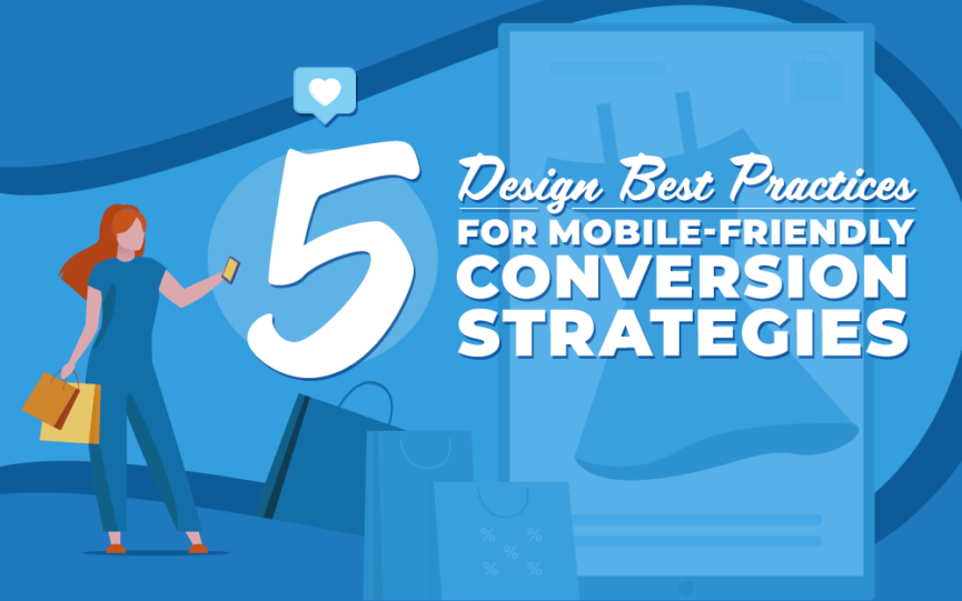
Design Best Practices for Mobile Strategies
1. Get to the Point with Short Copy
Small mobile screens mean each message and call to action (CTA) must be conveyed quickly. A mobile CTA should be particularly short and actionable. For example, an acceptable desktop CTA could be “Sign me up today” but for a mobile device, you’ll want to shorten the message to read something along the lines of “Sign up.” The most mobile-friendly copywriting will convey your message to mobile visitors in a succinct, clear, and compelling way.
2. Create CTAs that Stand Out
Mobile website visitors are likely visiting your site in the midst of being on the go. Therefore, it’s especially important to reduce friction to conversion as much as possible. An incredibly valuable way to accomplish this is to have each CTA stand out. A CTA stands out when both the design and messaging are compelling. The font size should be large enough to be easily noticed and leave no doubt as whether it is, in fact, a clickable CTA.
3. Make Buttons Clickable
This one may seem pretty obvious. But every conversion on your website will be through a CTA – so it warrants noting that buttons must be clickable. Buttons are a monumental component of the user experience, particularly on a landing page. No matter how sweet the deal is, a user is unlikely to convert when they experience difficulty in taking action on their device. In order to create a mobile experience that will facilitate conversions, make sure that each CTA, tab bar, and close or exit button is clickable.
4. Avoid Images
Desktop and mobile phone strategies should be approached in different ways, especially pertaining to images. It’s important to strategically leverage the limited space you have on mobile. Try not to use a large image that takes up space you could be using to convey your message. Additionally, you’ll want to pay special attention to the usage of mobile popups, which have more limitations than desktop popups. Best practices for mobile popups include ensuring that the popup does not take up the entire screen.
5. Limit Form Fields
No one enjoys filing out tons of information, especially on a mobile device. In order to avoid data-input fatigue for users, try to limit the amount of information you request. You should also utilize a single input field where it is practical to do so. For example, allow the user to type their first and last name in a single field. Limiting form fields on a mobile website is a great way reduce the risk of abandonment by avoiding unnecessary user frustration.
General Best Practices for Mobile Strategies
Remain Compliant
Mobile marketing policies can seem overwhelming. Lucky for you, we have a knack for decoding the jargon and creating simple mobile guidelines to follow for websites and SMS. So, Let’s simplify that intrusive interstitials policy from Google that we talked about earlier. Basically, you cannot create mobile popups that obstruct content. This includes overlays that gray out the website content. Through these guidelines, Google aims to penalize websites that are designed in a way that may prevent the user from reading the website content at any time.
One Size Does Not Fit All
There truly is no one-size-fits-all approach to mobile website optimization. While remaining compliant and keeping the above tips in mind, you should still be creating a personalized experience on mobile. This requires segmented messaging at the most relevant stages of each shopper’s journey, without disrupting that journey at any point in time.
It’s a Mobile World – Optimization Strategies Must Live in it
Conversion rate optimization is a fundamental part of marketing. And any marketing expert will tell you how important it is for your optimization strategy to be progressive. The world is always changing and it’s important for your strategies to change with it. With mobile devices driving the majority of website visits, it’s crucial to follow mobile design best practices.
Ready to Take Your Mobile Marketing Strategy to the Next Level?
Check out UpSellit’s SMS Marketing Compliance Guide. Grab this FREE resource to learn how to comply with the rules surrounding one of the most effective marketing channels for online businesses!
