A compelling email signup form is your ticket to a list of interested subscribers. While businesses are busy concentrating on other aspects of their marketing efforts, they overlook the incredible potential for customer acquisition that lies within email signup forms. In fact, this approach serves as a promising foundation for cultivating a dedicated and loyal customer base.
While a form is a pivotal part of your strategy, it is not sufficient on its own. Our blog unveils 10 practices to maximize signup potential. From design to incentives, we reveal steps for high-performing forms. Our tips will enable you to enhance CTAs, adopt mobile-friendly designs, utilize the impact of pop-ups, and provide enticing incentives.
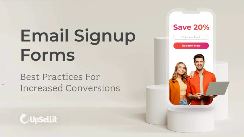
How to Launch a High Converting Email Signup Form
To create a highly effective email signup form with a strong conversion rate, the pillars of success are design, messaging and placement. The impact of your form is not only determined by its user-friendliness and visual appearance, but also the strategic placing, functionality, and messaging.
Start by deciding what you want the form to achieve. Do you want more people to join your newsletter, show interest in a free trial or giveaway, or improve customer relationships? Knowing this will help you decide where to put the form, along with other important details like messaging and form fields.
To help you improve your form’s effectiveness, here are ten important tips that will make your email signup forms work better for you.
10 Tips for Email Signup Forms Increased Conversions
1. Craft Clear and Actionable CTAs
Entice users to signup with a compelling call-to-action (CTA) button. Your CTA button is the path users take to bring them onto the next stage of the onboarding process.
It’s an opportunity to convince users to sign on. Use action-oriented text that encourages users and clearly communicates what they’re receiving from clicking the button. Popular phrases such as “Get Started”, “Unlock Access”, and “Join Now” can stir a sense of urgency and excitement. Visual aspects such as presenting contrasting colors can also make a difference.
In this example, the CTA “Get Real” is action-oriented and attention grabbing. It plays into the company mission to offer easy-to-make, healthy “real” meals.

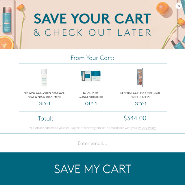
2. Create Mobile-Friendly Designs
When implementing forms, don’t forget that many consumers may access it via a smartphone. This means you should ensure your form is readable and visually appealing on a mobile format.
With an overall smaller screen size to convey a message, generate a lead, or make a conversion, it’s crucial to focus on mobile design best practices. A clean, brand-consistent design works well. Limit use of design elements to draw attention to the form.
In the example shown, the engagement is made readable to a mobile audience. The CTA, copy, and cart items utilize the smaller space so that mobile users will be drawn to save their carts.
3. Implement Pop-Ups
When implementing pop-ups, remember that they should be done in a manner that is beneficial to your goals, rather than disrupting the user experience.
Pop-ups implemented at the wrong time can have an adverse effect and bother shoppers. Schedule them to display at appropriate times such as upon entry, exit-intent, or when a specific action is taken or a set amount of time has passed.
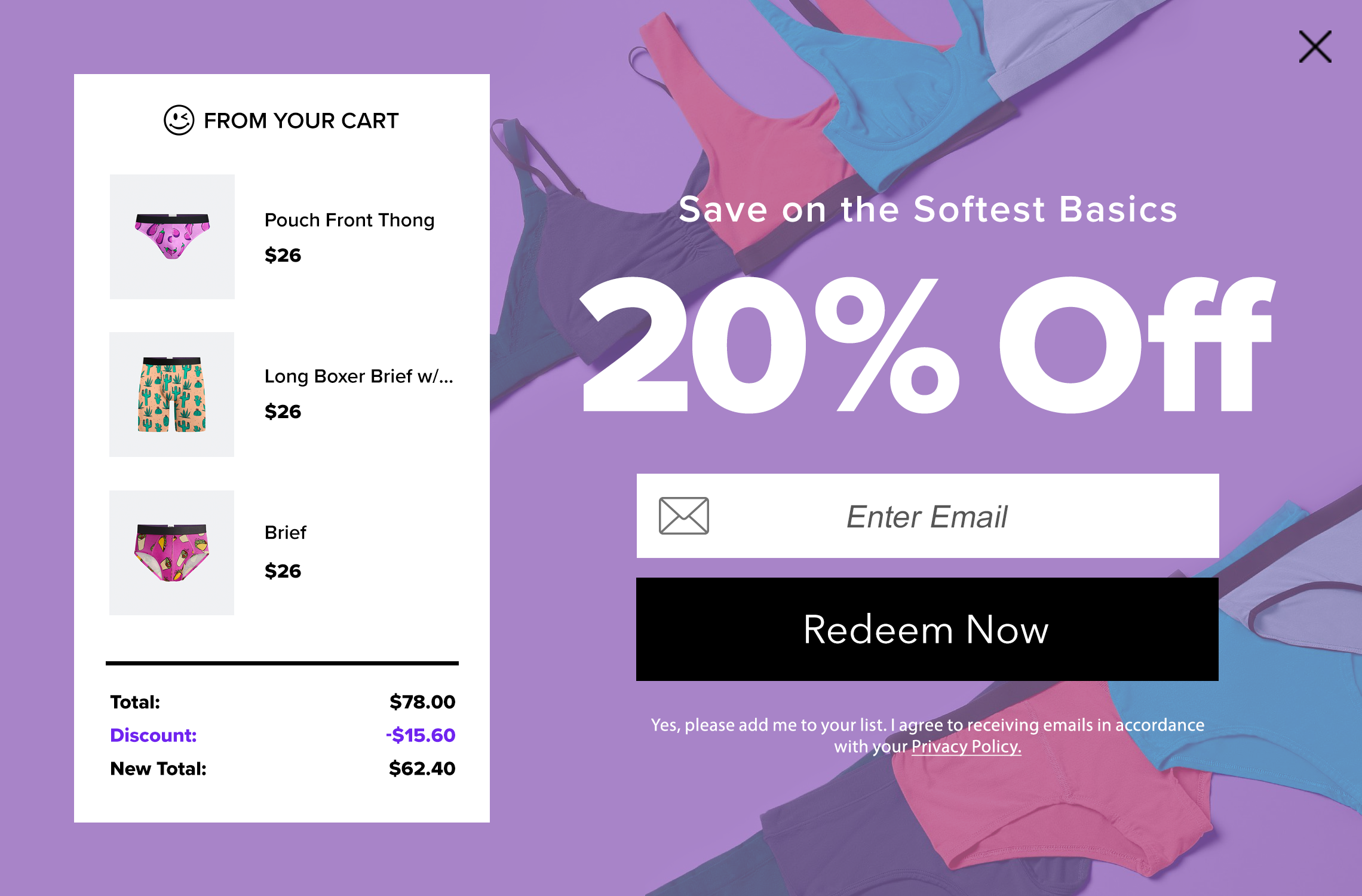
4. Offer Incentives and Reiterate Offers
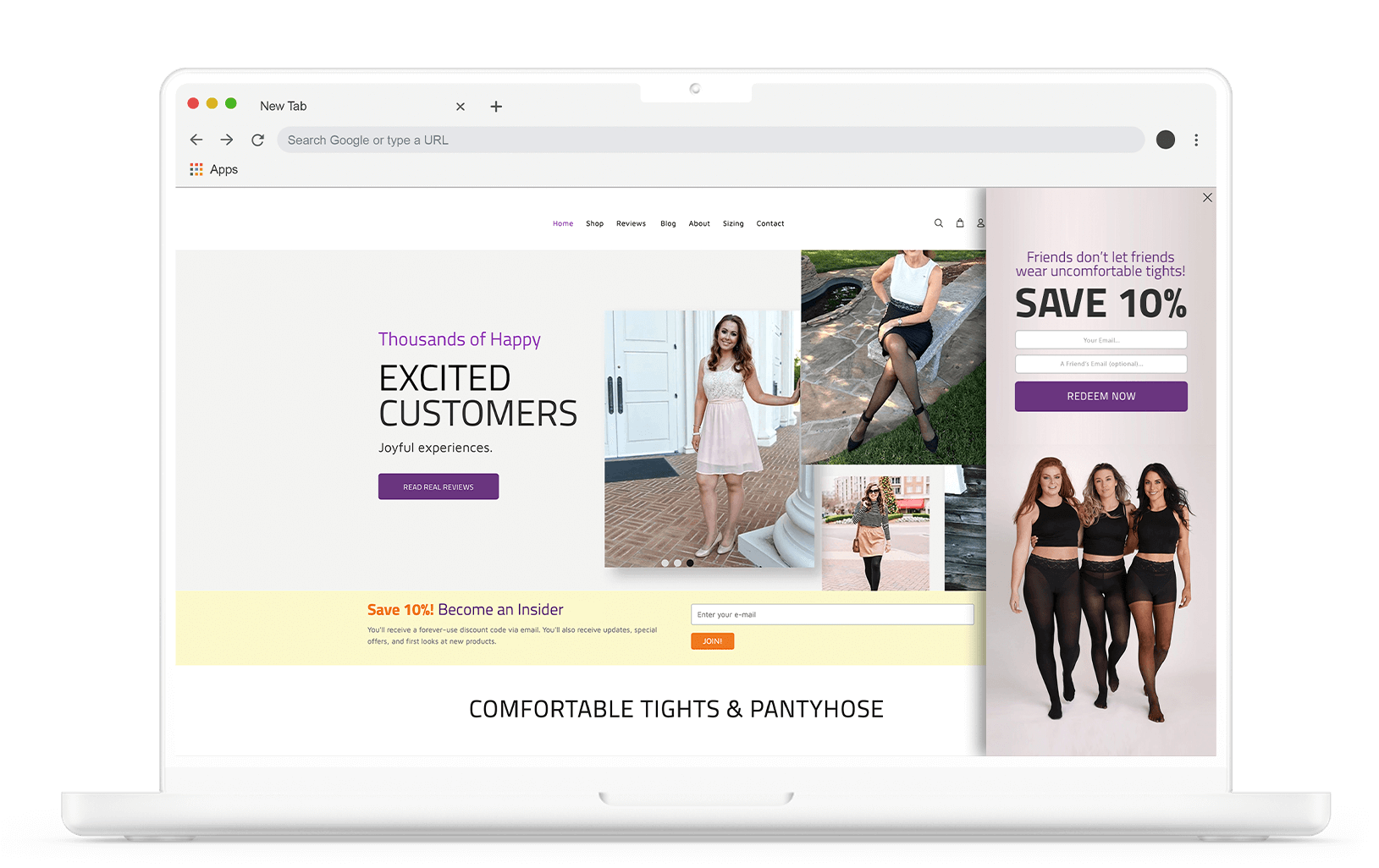
Incentives such as materials, promotions, and exclusive deals are another way to increase the success of your email form. Encourage visitors to signup by clearly demonstrating the rewards they get for offering their information.
In the example below, the engagement collects shopper’s email addresses by offering a 20% off incentive and highlighting their savings.
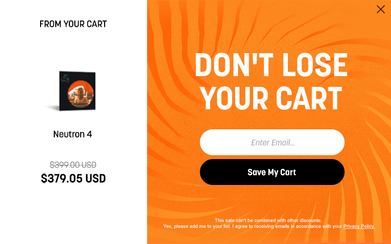
If your strategy doesn’t include offering incentives, you can still leverage a pre-existing offer. In the example below, a pre-existing sale is leveraged to encourage shoppers to save their carts and shopping progress.
5. Use Progressive Profiling
One mistake businesses can make with email signup forms is asking for all the information upfront and overwhelming users. Instead of asking for a lot of information in the beginning, try out progressive profiling.
By progressive profiling, you gather additional details and gain more information on users gradually over time. Gathering information such as their email, interactions, pageviews, and purchases, allow you to create a profile that can be used to offer a better user experience. Spacing out the amount of work a user has to do to complete a form can reduce friction during initial signup phases by offering a more seamless journey.
6. A/B Testing Form Lengths
As an alternative to progressive profiling, find out exactly what time of form works best for your audience by A/B testing your forms. Experiment with both short and long forms to discern which resonates more effectively with the specific target demographic.
Depending on your target demographic, it can be beneficial to implement a longer form with more details, as it can lead to more qualified signups.
By meticulously testing diverse variations of the signup form encompassing factors such as design, copy, incentives, and placement, marketers can identify the most effective elements.
7. Placement
Strategic placement emerges as a linchpin for success when optimizing your email signup form. A prominent placement ensures that the forms are not only easily visible, but also seamlessly integrated into the user experience. The header, footer, sidebar, and within content are common positions for form visibility to serve as navigational markers for potential subscribers.
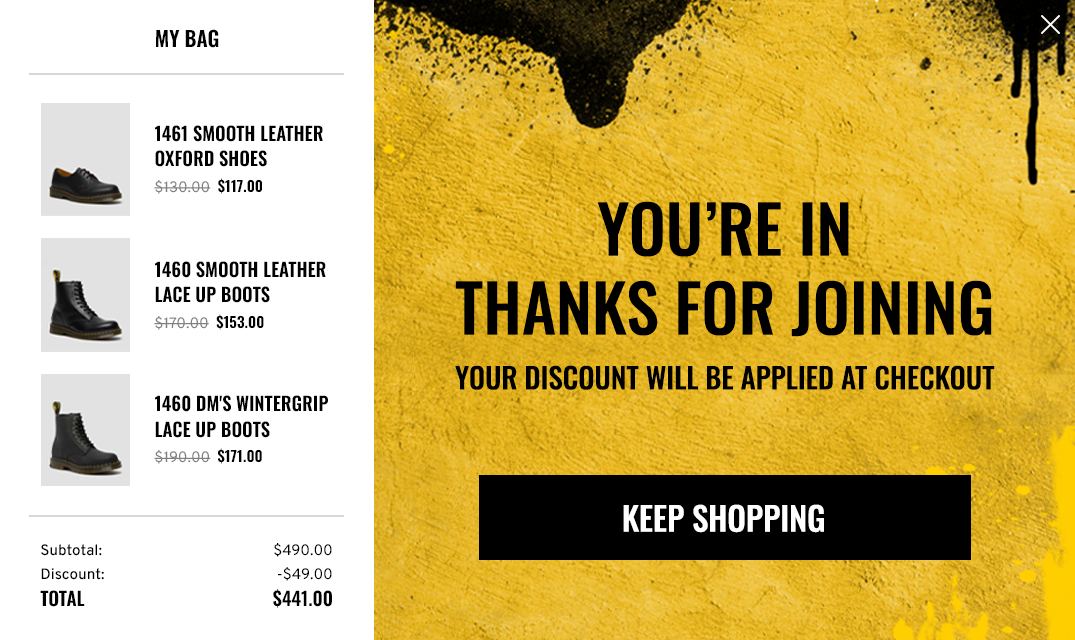
8. Thank-You Page and Welcome Email
Thank-you pages and welcome emails are vital for user satisfaction. Thank-you pages confirm signup success and motivate further exploration, while welcome emails confirm subscriptions and provide valuable information. These elements create a smooth onboarding experience, build trust, and establish a positive connection with users.
In the example below, a user is shown a thank you page and confirmation of their discount after they’ve finished signing up for an email list. The engagement confirms a user has signed up, while also motivating further action with the CTA “Keep Shopping”.
9. Highlight Privacy & Trust
Consumers are concerned about the security of their information when they fill out email signup forms. To address any apprehensions associated with these forms, it’s essential to provide a prominently displayed privacy policy that guarantees the safety of users’ data. This policy should reassure users that their information will be handled securely and that signing up won’t result in unwanted spam. Emphasizing the importance of privacy in this way can help establish trust and foster positive relationships with shoppers.
10. Monitor & Optimize
Actively tracking conversion rates, click-through rates, and bounce rates to gain a comprehensive perspective on the performance of your forms. These metrics serve as your compass, illuminating not only the effectiveness of your signup forms but also pinpointing precise areas for enhancement. This invaluable insight forms the cornerstone for refining your signup forms, tailoring them to resonate seamlessly with your audience’s preferences and expectations.
Launch the Perfect Email Remarketing Campaign
Once you’ve built a base of interested subscribers, the next step in boosting conversions is to create a compelling email marketing campaign that encourages shoppers to return to your site.
Abandonment patterns can provide insights into shopper behavior. There are various reasons why shoppers might abandon their carts, and it’s especially frustrating when they’re on the verge of making a purchase but then leave. To lure these potential customers back, consider implementing a well-planned cart abandonment email remarketing campaign, offering them a good reason to complete their purchase.
As a bonus tip, you can encourage users to provide their email addresses by offering to save their shopping carts. This not only helps you collect valuable leads but also initiates the remarketing process.
Discover more best practices for an abandonment email strategy and get started winning shoppers back and recovering otherwise lost sales.
Expand Your Subscriber Base with Best Practices
By implementing these best practices, you’ll enhance your email signup rates, leading to a more engaged and high-quality subscriber base.
Crafting an effective form is the initial step toward acquiring loyal customers. To maintain ongoing success, consistently analyze, gather feedback, and refine your form.
When you pair your enhanced signup form with a well-executed email marketing campaign, you’ll amplify your ability to re-engage and convert users seamlessly.
Discover More Solutions to Bring Shoppers Back to Your Site
With 80% of abandoned shoppers never returning, obtaining contact information is vital for building relationships and driving long-term revenue.
UpSellit’s New-to-File Leads Case Study details personalized lead generation strategies and their impact on collecting new email addresses from shoppers. Explore these strategies to learn how UpSellit recovers 61% of abandoning shoppers before they leave for good, helping clients build a strong and profitable subscriber base.