When we discuss optimizing email marketing, we often turn our attention to subject lines rather than email preheaders.
While they’re often overlooked, preheaders are a valuable tool. They provide additional space to effectively communicate why users should engage with your email.
Though subject lines are often the first to grab a user’s attention, the preheader can create a perfect one-two punch that increases open rates, and by extension, click throughs and conversions.
What is an Email Preheader?
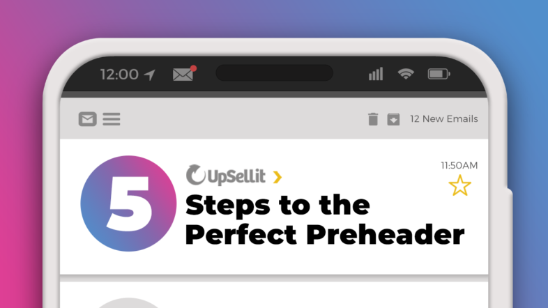
The preheader text is the short piece of text that is displayed next to the subject line within a user’s inbox. Preheader texts occasionally appear at the top of an email – however this is largely dependent on the user’s email provider.
While the subject line is the first opportunity to grab the user’s attention, the preheader offers a free second chance. It allows you to provide a short summary of what’s to come in your email. By using a preheader text, you also nearly double the amount of virtual “real estate” your message gets in a user’s inbox.
If you don’t intentionally create preheader text, the preview text is populated by the first sentences of the email.
Unfortunately, many preheader captions look like this.
Most emails are going to contain graphics – so why use up the small area you have to offer unnecessary clarification?
Instead, you can use this line of text to build a better email campaign and more effectively engage the users on your email list.
Benefits of Email Preheader Texts
The email preview text is an opportunity to convince people to open your email. Since it’s one of the first things readers will see, adding a preheader is a chance to hook people in and convince them to continue reading. It’s your second chance after the subject line to capture your reader’s attention.
In a mass of marketing emails, your email can stand out against the competition with an engaging preheader. Taking advantage of the preview text space can give you a competitive advantage, helping readers choose your email over others.
Another benefit of email preheader texts is that you can avoid accidentally displaying the wrong information right away. If you don’t set a preheader, email services will automatically display a snippet of text. This can contain words that drive readers away, such as “unsubscribe now” or “view in web browser”. Your email will look more professional and personal with a set preheader.
5 Best Practices for an Effective Email Preheader
So now that we know why preheaders are important, let’s discuss 5 attributes of a high quality, engaging preheader.
1. Keep it Concise
When crafting an effective email preheader, your first concern should be space. Preheaders need to be viewable on both desktop and mobile devices – in fact, research shows that nearly half of emails are now opened on mobile devices.
Although viewable characters vary by email platform, it’s usually safe to assume that users can see between 50 and 100 characters, including spaces. On some mobile devices, though, all 100 characters will not be visible. So, as an email preheader best practice, keep it between 50 and 80 characters.
The safest bet when debating preheader lengths is sticking to the low end of this threshold and front-loading important information. In general, the shorter and snappier your preheader is, the better.
2. Connect to Your Subject Line
The preheader is a second opportunity to engage your customer. Avoid repetition. When viewed in an inbox, the subject line and preheader text accompany one another, so don’t misuse this inbox space by repeating the subject line. Give the user a reason to click through.
In addition, email subject lines are supposed to be short – so preheader text is an opportunity to expand on content that was sacrificed for an optimized subject line length. You can use the preheader text as an opportunity to provide additional context to what your email includes.
Consider the preheader text an extension of the subject line. The two should complement one another. Let them work together to create a cohesive message that informs and persuades.

In this example, Fabletics uses the preview text to expand on the subject line. They work together to engage the reader, hooking them in and then offering more information. Your email subject line and preheader text are valuable tools to drive home a point.
3. Include a Call to Action
Call to Actions can be an effective way to communicate your message and get straight to the point when used in a preheader.
Since the preheader is one of the first things people read in your email, it is your chance to convince them to continue reading. A clear CTA can draw people in and convince them that an email is worth opening.
If your email is informing users of an exclusive deal, using a call to action in the preheader can be highly effective. “Shop now” or “get it while it lasts” elicits action and even creates urgency.
A call to action can also spark curiosity. For example, encouraging users to “learn more” or offering details about a discount can tempt them to continue reading.
4. Personalize Using Customer Details
If the subject line didn’t include personalization, take advantage of the preheader to engage the customer. Provide a personalized ecommerce experience using information such as a shopper’s name, location, or user history.
Our minds more readily recognize our own name more than other words. Grab your customer’s eye with their own name or utilize geographical details. Personalization can make your email stand out in a generic inbox.
Sephora reiterates their subject line message in the preheader, but adds personalization by including the customer’s first name.
You can also offer a more personalized experience by referencing a user’s browser history. Information such as if they’ve purchased from your site before can help you offer personalized product recommendations. User history can also let you know if a shopper has a saved cart, so that you can notify them that their items are waiting.
Connect to your readers in the preheader by sparking their curiosity and asking a question.

In this example, Peet’s engages their readers with an upbeat question. Questions can be more personal because they are engaging and they speak directly to your reader.
Personalize your emails further by keeping on top of trends that can catch the attention of shoppers. Learn more about how to provide the most tailored user experience in Upsellit’s Website Personalization Trends to Use in 2023.
5. Avoid Spam Words
Using spam words, such as “save” and “expire” can trigger filters that will send your email to a spam folder. Avoiding spam words is a good practice to make sure your emails get opened.
Another reason to avoid spam words is that they can make your email come off as impersonal or generic. Shoppers might not open an email that contains a lot of spam words because they come off as gimmicky.
You want to establish trust with customers and represent your brand as credible. Steering away from spam words can improve your brand’s image.
Placing an emoji in the preview text can be a lighthearted, engaging addition to your message. However, be aware that too many emojis can make your brand appear “spammy”. Emojis might not be right for every brand, so take your brand’s image into consideration.
Increase Open Rates with Upsellit
Upsellit offers a variety of remarketing strategies that bring users back to your site with relevant and dynamic emails. Email remarketing allows you to build a relationship with your customers and personalize the user experience. A more personalized experience leads to higher open rates, more engaged customers, and increased conversions.
Upsellit can convert shoppers with one-to-one marketing that determines the optimal strategy, launch time, and messaging to guide customers to purchase. Send your customers emails they will want to open.
In addition to email remarketing, Upsellit’s lead capture strategies turn anonymous shoppers into new leads. You can grow your email list with Upsellit’s on-site marketing strategies which collect new data from shoppers at every stage of the customer journey.
Optimize Your Email Marketing Strategy
Check out Upsellit’s 27 Attributes of an Effective Email. This in-depth guide covers the ins-and-outs of crafting the perfect remarketing email. It’s a great resource and it’s totally free! Download it today and start writing awesome emails that convert.


